Jane averaged 150,000 unique users a month with a conversion rate of 7 percent in early 2019. After the launch of Product Card 3.0, conversion rates increased from 7 percent to 10 percent based on critical insights collected from nine months of R&D using Mixpanel and Google Analytics.
Jane Product Cards
LEAD PRODUCT DESIGNER
Jane Technologies, Inc. is a retail tech company behind iheartjane.com—the cannabis industry's only complete online marketplace, providing consumers with an intuitive user experience. Users can browse local products in real-time, compare by price, proximity, or popularity, and place orders at local dispensaries.
Team
Head of Engineering, Project Manager, 2 Front End Engineers, Design Lead (Me)
Contributions
Implemented tests and maintained new user-facing functionality Interviewed users, store owners, and budtenders to gather feedback and data on pain points, user behaviors, facts, needs, and goals Created wireframes and prototypes to share with partner success and dispensary operators for usability testing Collaborated with partner success and content team Produced an end-to-end solution for responsive web and in-store kiosk Led design Q&A
How might we improve the scannability and reduce the
product card size to enhance the shopping experience?
Hypothesis
By improving the product card hierarchy and aligning the cards to a grid system, we can double
the number of cards on the screen and offer a more valuable shopping experience.
X
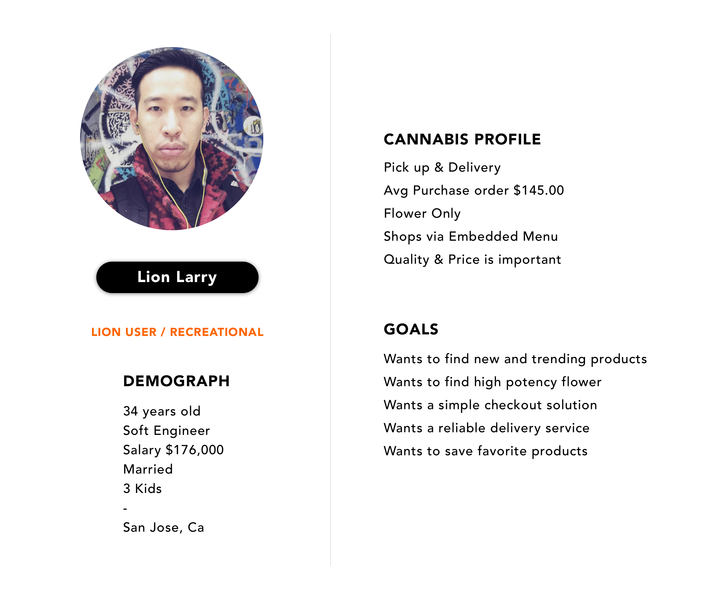
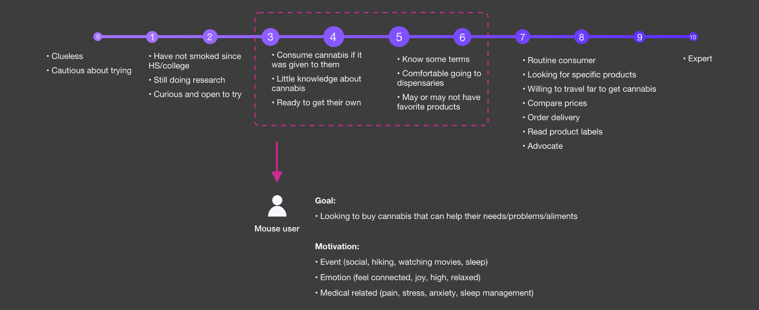
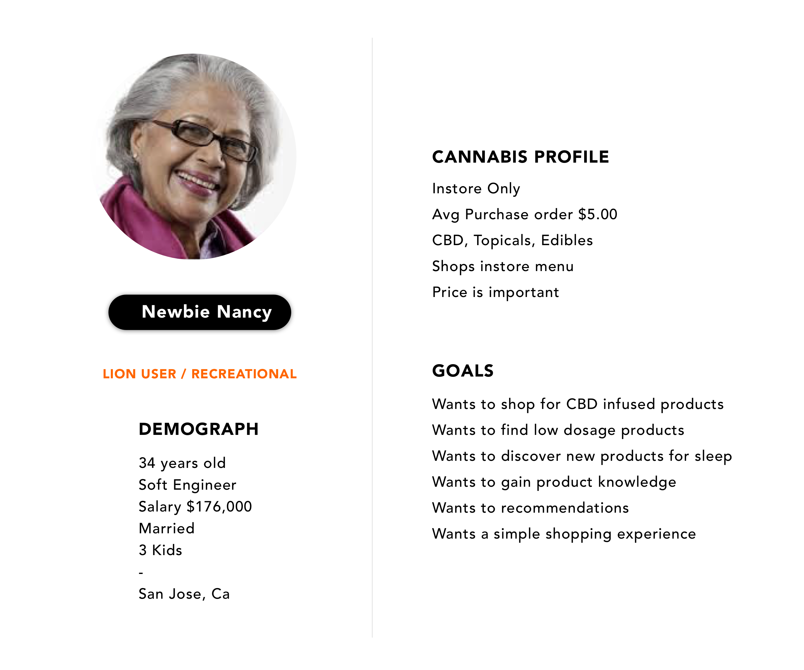
Jane User Personas
User personas reflect real iheartjane users based on shopping habits and cannabis usage. The primary persona, Casual Connie, is the target user for this redesign; she shops via pick-up and delivery and uses iheartjane both on both desktop and mobile. Casual Connie needs a prominent Call to Action, an experience rich with product details and imagery.
-
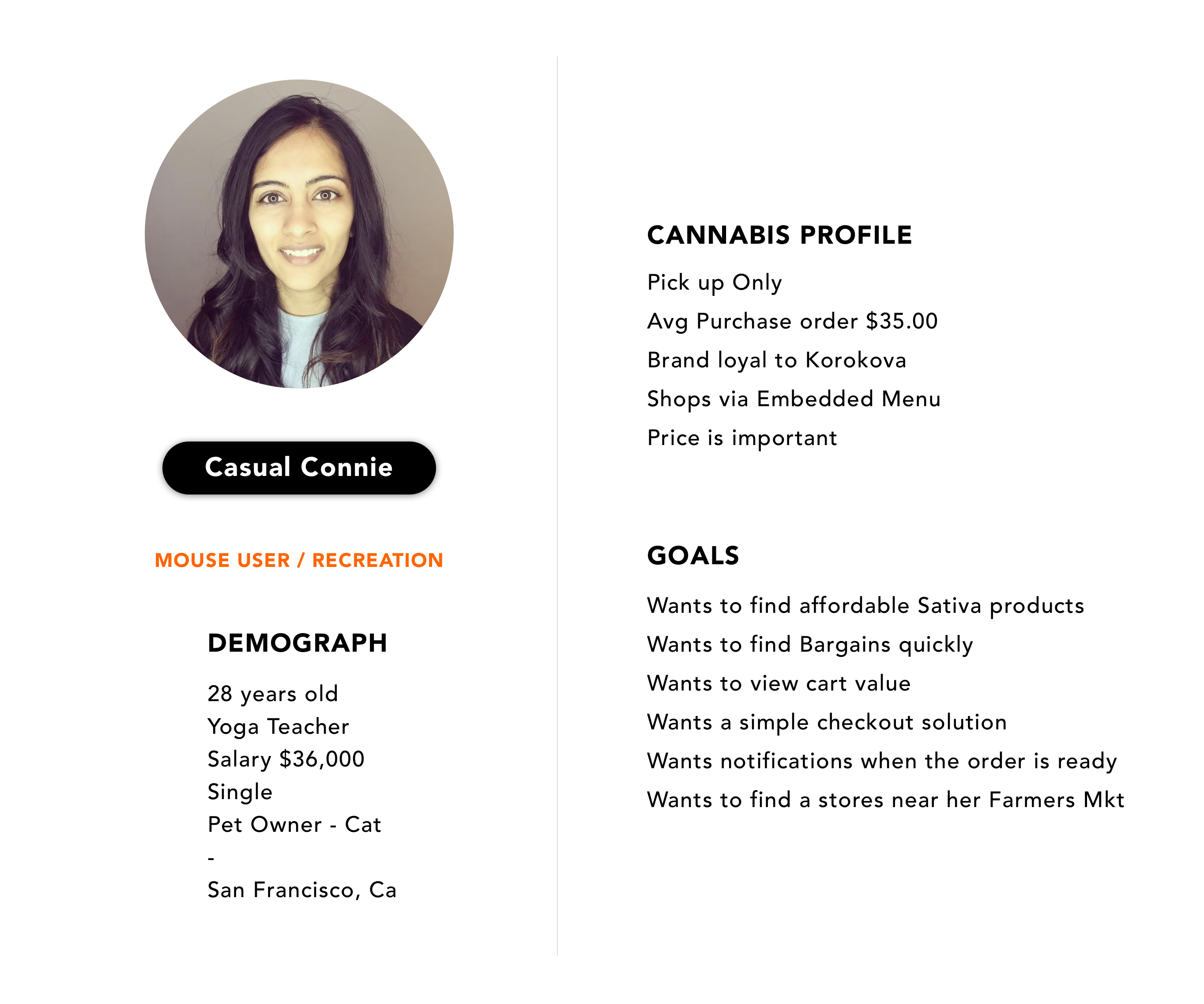
MOUSE USER / RECREATION
-
MOUSE USER / RECREATIONAL
Product Card 1.0
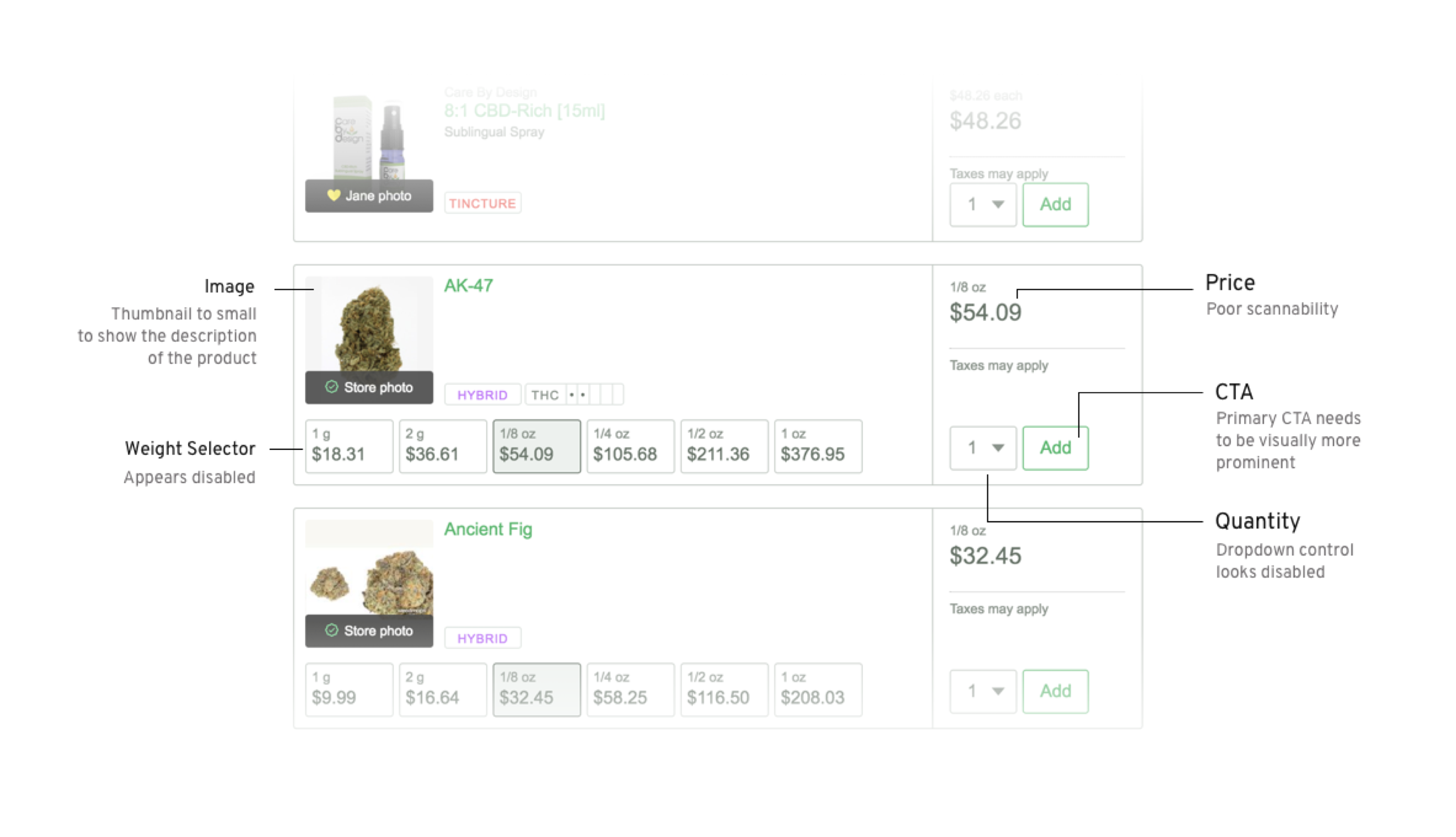
In this role at ihearthjane, I inherited the design component below from an outside agency. Through several usability testing rounds, I discovered issues that directly affect user shopping behavior, such as adding products to the cart, finding a nearby store, and checking out.
X
Usability Issues
Here are the critical usability issues discovered during the usability testing for Product Card 1.0.
Cons
1. Horizontal orientation only
2. Breaks the grid
3. Product card unresponsive
4. Image dimensions too small
5. “Add to Cart” CTA hidden
6. Hidden brand names
7. THC levels not displayed
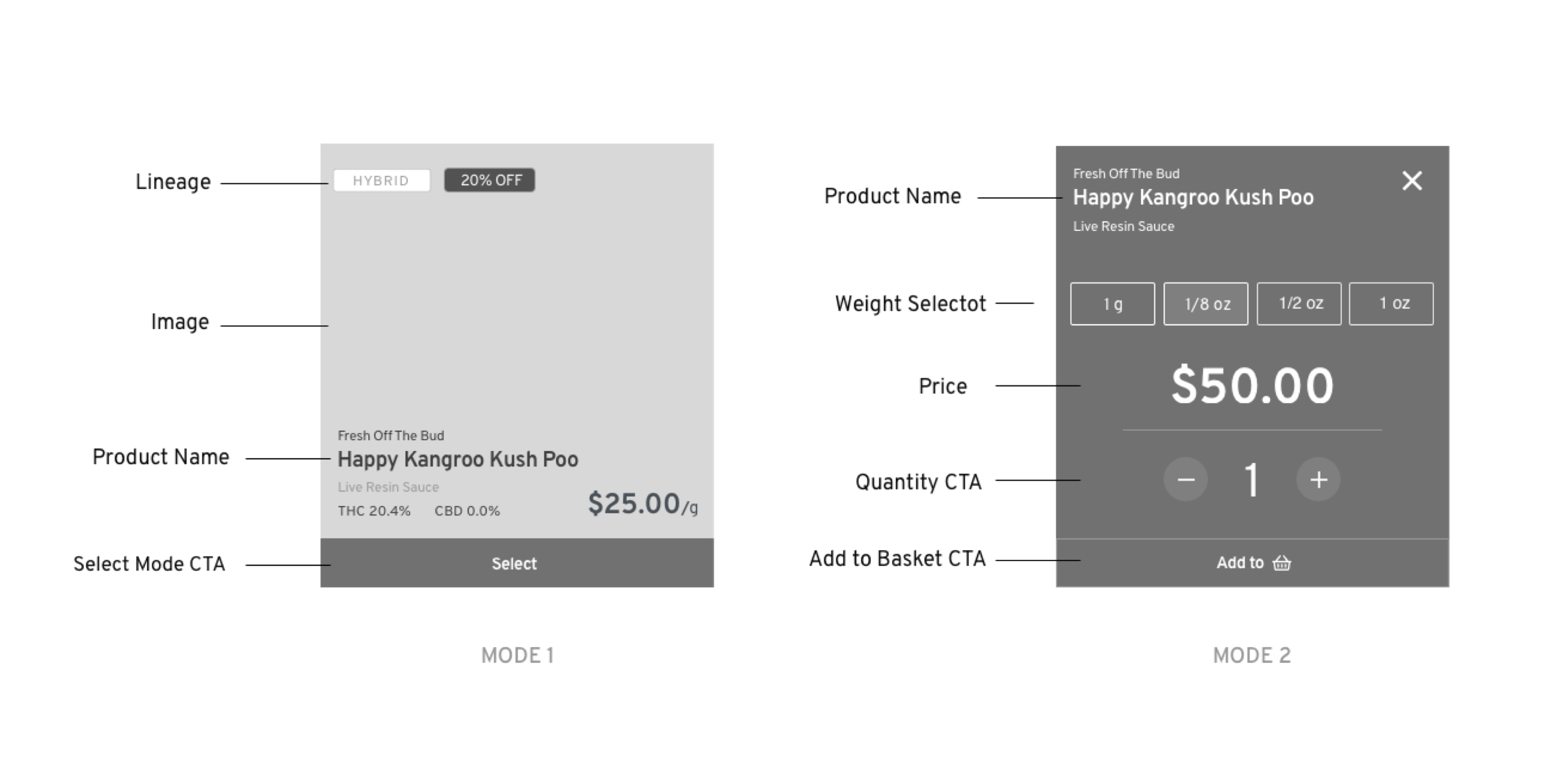
Product Card 2.0 Wireframes
After gathering feedback from user interviews and analyzing the data, I abstractly understood the customer’s pain points with Product Card 1.0. As a result, I could formulate a potential design solution to answer their needs in Product Card 2.0.
Following are the high-level requirement attributes necessary to enhance the “Jane” shopping experience:
1. Product Image
2. Lineage
3. Product name
4. ”Select” CTA
5. Price
6. Weight selector
7. Quantity selector
X
X
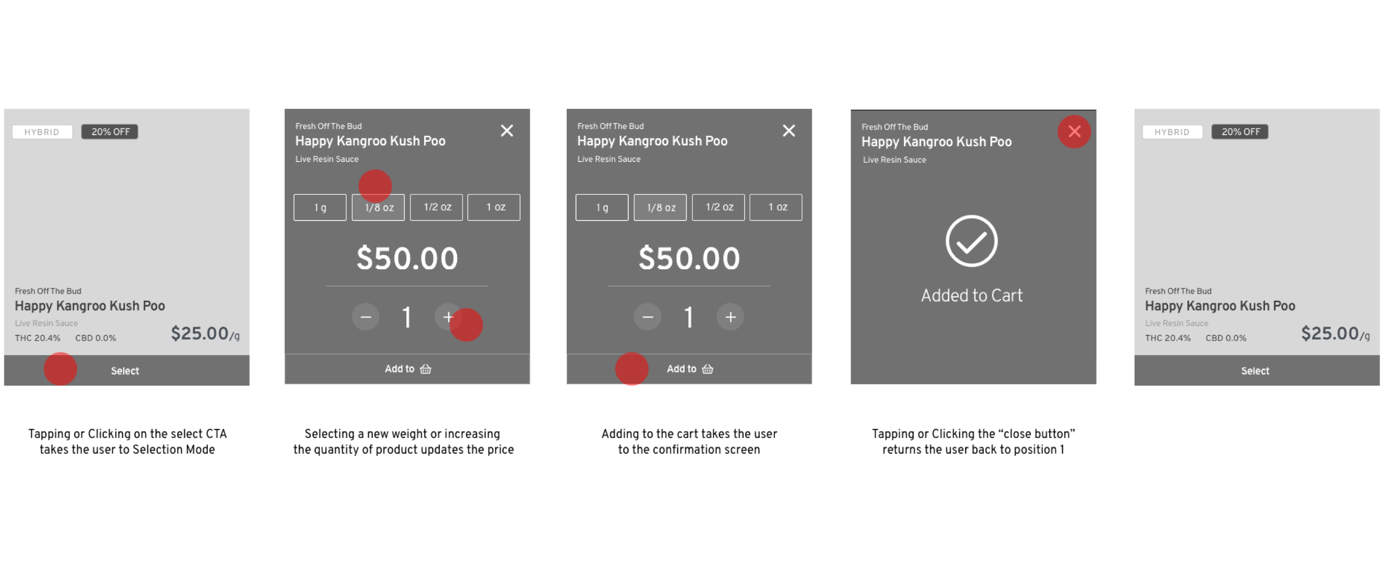
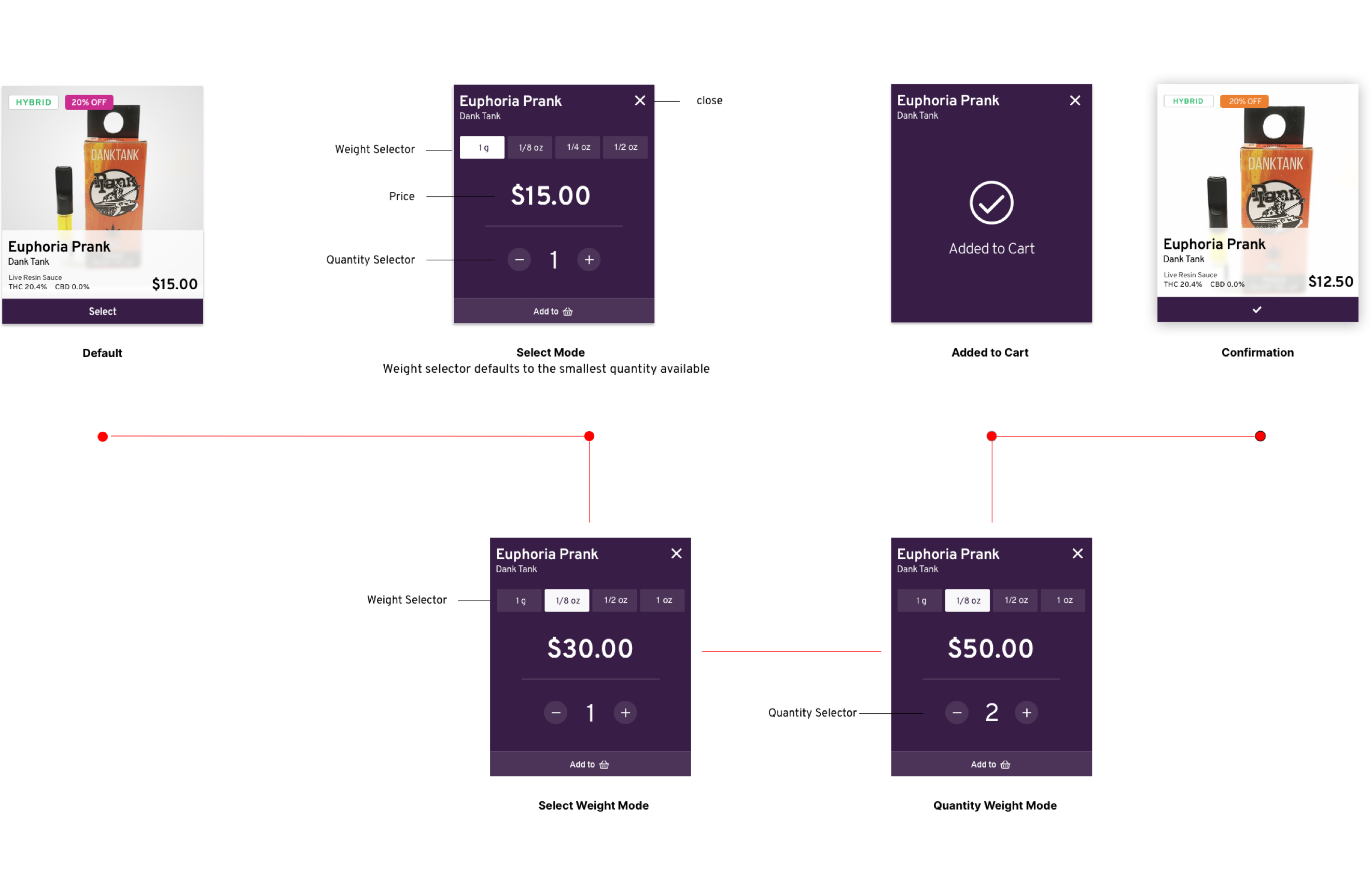
Product card interaction flow
Product Card 2.0 is a complete redesign of the layout and structure of the product card interface, static, and selection mode. I moved the main interactions into the second mode, giving the user the ability to manage the weight and quantity selector. The “Add to cart” prompt is the second most valuable CTA on the site and now lives in a bold primary button.
X
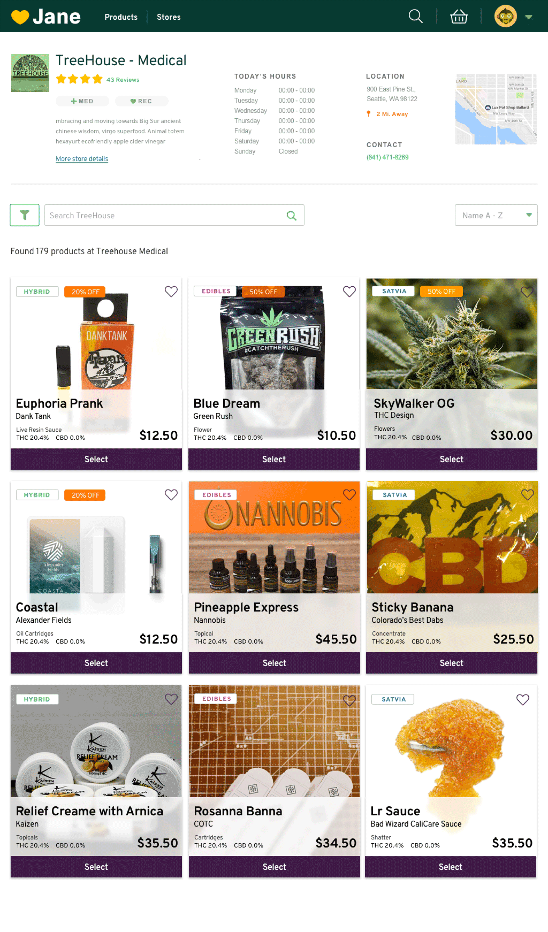
Product Card Grid View
Understanding how the product cards fit within the context of a store page is essential. Now that the product cards are within a grid layout, it is more natural for a user to view multiple products. Additionally, there is an improvement in overall page scannability, and the CTA call outs are clear.
X
Product Card 3.0 Requirements
A few months ago, we decided to rethink the product card. The feedback ranged from the large size
of the card, scaling down the product image size, decreasing the width, and adding more cards to
the product row. It became undeniable that there was an opportunity to improve the user experience.
Objectives
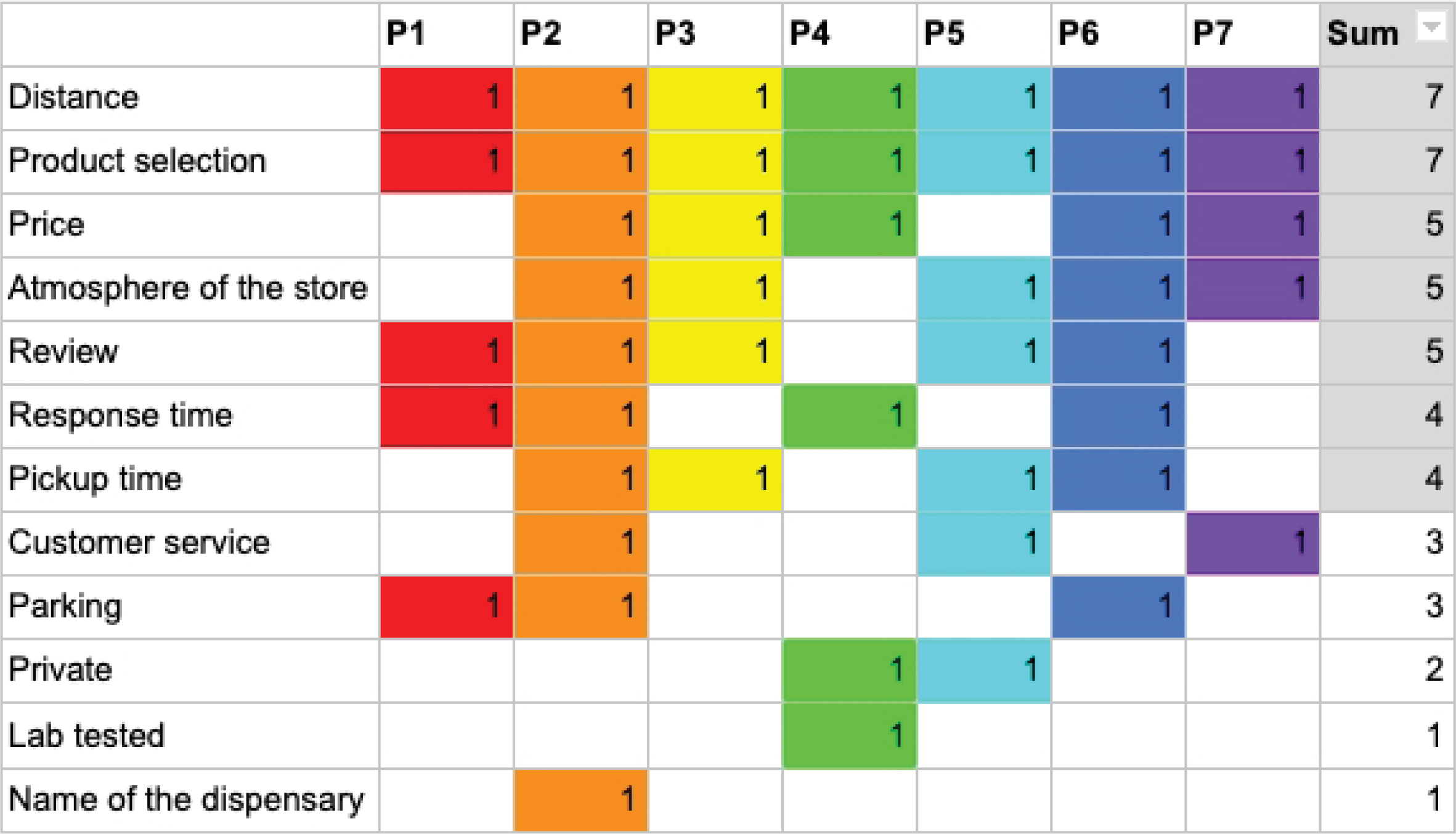
In the testing phase, I crafted a user testing scheme that would focus on validating the usability of product card 3.0 through A/B testing. We tested the product cards against six breakpoints from desktop to mobile.
After several rounds of user testing and gathering measurable feedback from users, I looked at the product roadmap and drafted guidelines for the next three sprints. The product team sorted the priorities by issue, type, and frequency. Here is the structure:
.
Product Card 3.0
Slimmer in design, the final card now allows for a tighter grid system. Scaling down the image brought a balance between the image and product content and created an overall natural hierarchy stack.
X
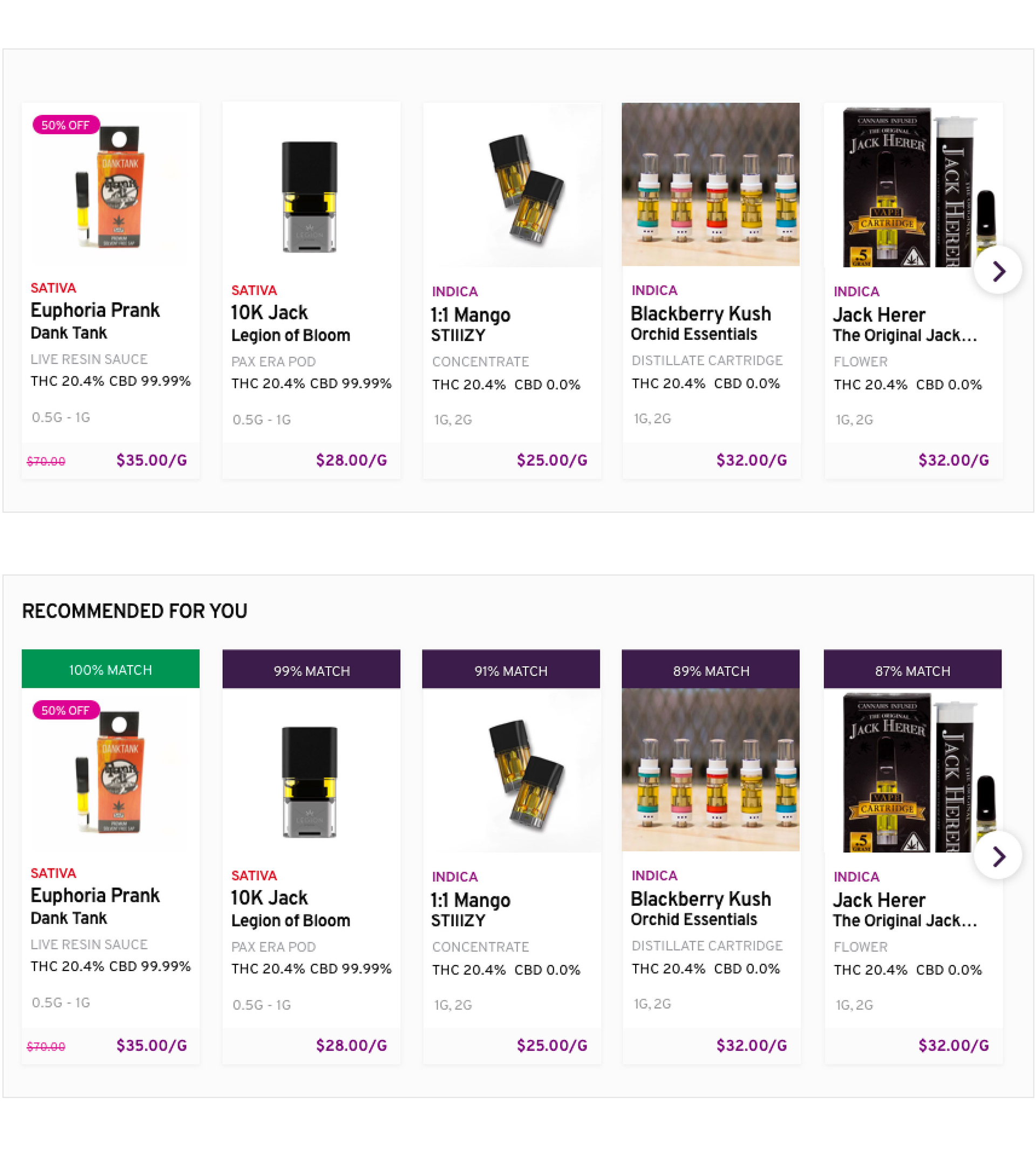
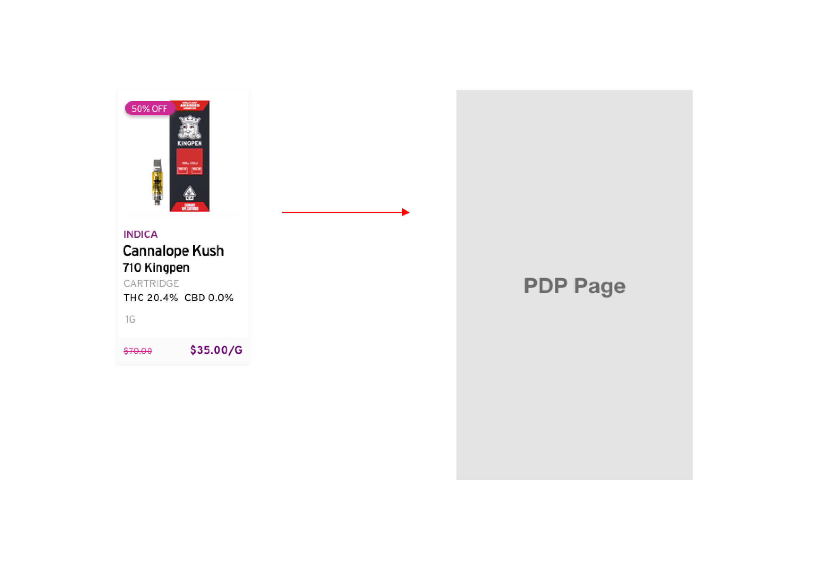
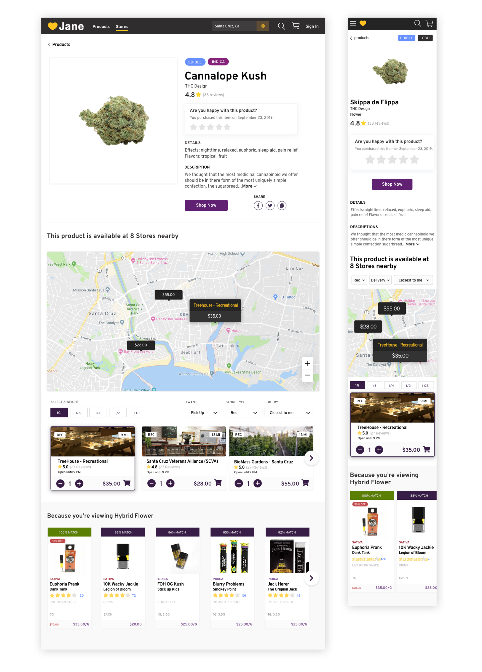
New Interaction Pattern
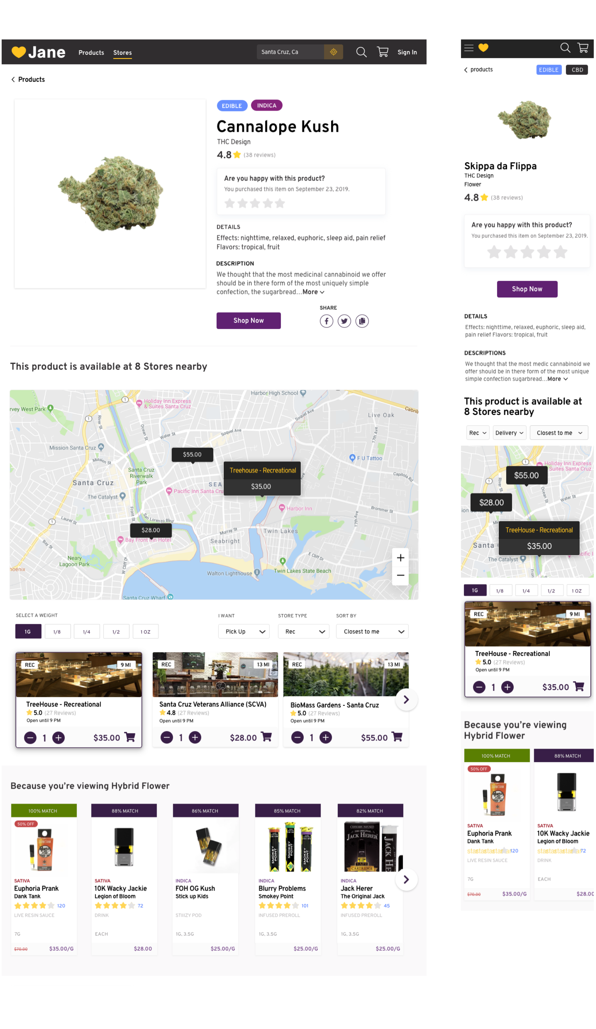
Removing the “select mode” interaction from product card version 2.0 produced a more traditional product card. I created an interaction pattern that drives the user to a data-rich Product PDP page. The Product PDP allows the user to see the product image, product details, and map view to select a store for pick-up or delivery with a newly launched recommendation engine.
X
X